Dear Martin,
First of all, let me assure you there is no such thing as a stupid question and no subject is too trivial for us here at What the Heck? In fact, there’s nothing we like better than these little questions that niggle at you once you stop to think about them, but never seem to have a ready answer.
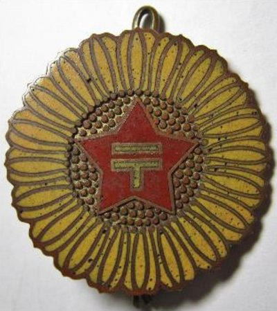
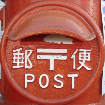
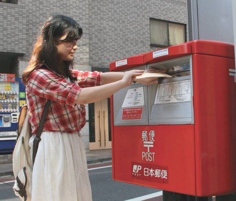
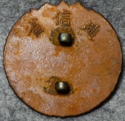
The symbol you’re asking about is officially called the yūbin kigō (postal symbol) but most people refer to it simply as the yūbin māku (postal mark). You are absolutely correct that it is specific to Japan; in fact, the Japan Post website warns users not to put it on international mail because it won’t be understood outside the country. But within Japan, it’s widely recognized as the symbol for the post system and has been in continuous use for more than 125 years.
To find out more, I went to the Communications Museum (Tei Park) in Tokyo’s Otemachi district for a crash course in Japanese postal history. The country’s first official system for delivering messages, I learned, was set up in the seventh century. Based on a model in Tang China, it consisted of a series of postal stations (eki) spaced approximately 16 km apart. Couriers relayed messages from one station to the next, along a fixed line. By the middle of the 19th century, there were multiple public and private delivery services, all based on this station system and serviced by foot couriers who came to be known as hikyaku (literally, “flying legs”).
I got sidetracked by the exhibits about the hikyaku, who seem to have been rough, colorful characters who expected everyone to get out of their way. They ran their routes in pairs, often scantily clad in only a loincloth, carrying the mail in a distinctive wooden box on the end of a pole slung over the shoulder. If you look for the loincloth and box, you can often pick hikyaku out in 19th-century woodblock prints, including works by famous artists such as Hokusai and Hiroshige.
Today, you can spot hikyaku painted on the side of many trucks operated by Sagawa Express, one of Japan’s major transportation and logistics companies. The company’s corporate mascot is Hikyaku-kun, a cartoon-like depiction of the traditional foot courier, who sports little more than a jaunty red fundoshi (loincloth). In the 1990s, Hikyaku-kun enjoyed a degree of infamy when an urban legend alleged you’d be lucky in love if you touched his loincloth. Presumably women all over the country were sidling up to Sagawa trucks to fondle the fundoshi.
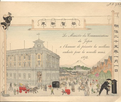
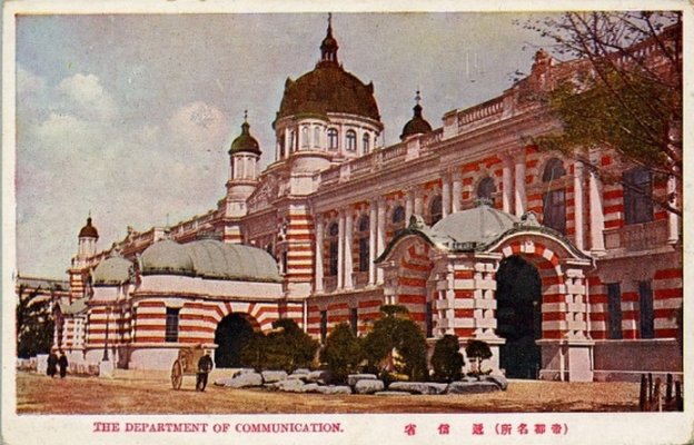
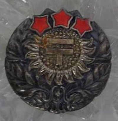
Returning to the task at hand, I was happy to find a number of exhibits that spoke directly to your question. Museum curator Rika Ishii guided me through them, explaining that the postal mark was designed in 1887 to be the symbol for the newly created Ministry of Communications and Transportation (Teishin-shō), which was given the responsibility to develop a modern postal system. The design of the symbol, she said, is based on the katakana character “te” for the word “teishin” (communications) in the ministry’s name.
I mentioned that I’d seen another explanation on the Internet, which is that authorities originally planned to use the letter “T” but modified it with the bar over the top after learning that “T” was an international symbol for inadequate postage. Ishii said this is a misunderstanding caused by an early typographical error. On Feb. 8, 1887, the day the symbol was announced in the official record, what was supposed to have been a 〒 got into the announcement as a “T.” The error was corrected in a notice eight days later, but still seems to cause confusion. [забавная легенда

]
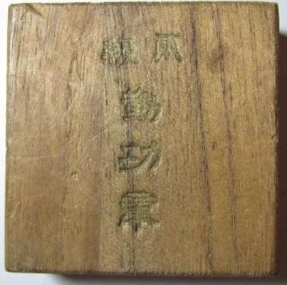
Ishii also took me through exhibits about Hisoka Maejima (1835-1919), a maverick statesman, politician and businessman who created the modern Japanese postal service, advocating low-cost, universal service and the use of prepaid postal stamps. Maejima personally coined the Japanese words for “post” (yūbin), “stamp” (kitte), and “postcard” (hagaki), and is known as “Yūbin Seido no Chichi” (“Father of the Postal System”). His portrait graces the ¥1 stamp.
As you mentioned, the symbol for the postal system in Sweden is a horn. This is true in several other European countries as well, where horns were used to announce the arrival of the post. I was curious to know if Japanese postmen carried horns too, so Ishii showed me the yūbin rappa, a straight metal horn introduced as standard equipment in the 1890s. Post carriers would sound their horns when approaching a ferry crossing to alert the ferryman to have the boat ready, and when traveling in the mountains to scare off bears and other wild animals. There are also stories of carriers, lost in snow storms, who blew on their horns to alert rescuers of their position. Others used them to call for help when set upon by robbers or bandits. It seems that working for the post office was a dangerous occupation in those days: from 1873 Japanese mail carriers also carried pistols, until they were disarmed in 1945.
If you’re interested, now is the time to visit the museum. It’s closing in its current location at the end of August, and will reopen in the Tokyo Sky Tree in March 2014.